
Alright, Blazor enthusiasts! Today, we’re building something reusable — a shared component library in Blazor WebAssembly. This means you can finally stop recreating the same component in every project and instead enjoy the luxury of copy-pasting from a dedicated library. Let’s get to it!
Step 1: Set Up a Razor Class Library#
First up, let’s add a Razor Class Library to our solution. We’ll name it something sophisticated like BlazorWasm.Shared.
Here’s what you get out of the box:
- A wwwroot folder for serving static files like images, styles, and JavaScript (for all your fancy effects, of course).
- Sample files like exampleJsInterop.js and ExampleJsInterop.cs, which give a crash course in JavaScript interop with Blazor—a great example for doing it the right way.
- And finally, a starter component, Component1.razor, which we’re promptly deleting in true DIY style to make room for our own masterpieces.
Step 2: Organize Your Shared Component Library#
Let’s keep things tidy:
- Delete Component1.razor. (Farewell, example file, we hardly knew ye.)
- Create a new folder named Components in the BlazorWasm.Shared project.
- Inside Components, add a new Blazor component with a code-behind file and a CSS file. We’ll call it MySharedComponent.
Step 3: Build Your First Shared Component#
Time to work a little magic with this shared component!
In MySharedComponent.razor, add the following code:
| |
- We’ve added an h3 with the component name and a p tag that displays the Title parameter.
- The Title parameter is required, because if you’re not passing in a title, what’s even the point?
Step 4: Reference Your Shared Library in the Client Project#
Now that BlazorWasm.Shared is all set up, it’s time to show it off in our client project.
- Add a project reference to BlazorWasm.Shared from your client project so you can use the component library.
- Let’s give it a whirl on the Home.razor page of our Blazor app.
Add this at the top of Home.razor:
| |
And within the page, add:
| |
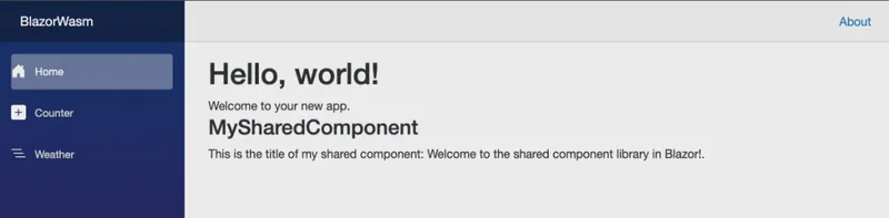
Fire up the app, and voila — your custom component should be there, title and all.
Get the Code#
Ready to dive in? Check out the full example code for this Blazor WebAssembly project on GitHub: medium-blazor-wasm.
Feel free to explore, experiment, and contribute!
What’s Next?#
This shared component library is just the beginning. In future posts, we’ll tackle:
- Adding Lottie animations to make your components extra lively.
- Using Tailwind CSS for stylish, responsive designs without all the fuss.
- Showcasing the right way to integrate JavaScript in your Blazor applications, so you can avoid some common pitfalls.
Stay tuned for more Blazor tips, and happy coding!